So I made a website
26th April 2025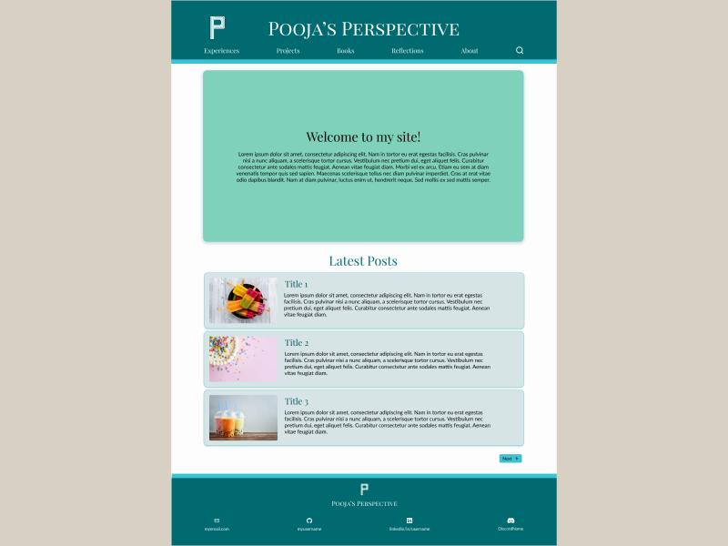
One of my goals last year was to create a website so that I can showcase all the projects I have in mind. As with most of my goals last year, it rolled on to this year. So, this year I decided to bite the bullet and decided my first project would be to create a website.
Purpose
The website would have mostly been a web portfolio at any other time focusing mostly on my coding projects. However, when I started the project my sister and I decided to go to Europe so then it seemed a good idea to record some of my travels as well. Then sometimes with books I read or movies I watch I would like to review them but I wanted those all to be in one place. The original web portfolio seemed like the ideal place for this and so slowly the idea evolve to become a blog.
The Planning
Prior to starting the project, I was not that familiar with web development and so I did some research. My initial concerns were buying a domain and hosting, but from my research I learned that GitHub allows you to host a static website built using Jekyll. There is documentation on how to implement this and so initially I followed that process. They have so many themes that you can use and customise as you see fit. However, I didn’t feel keen on any of the website themes and rather than finding one I liked, I thought it would be easier to create my own template using Jekyll, HTML, and CSS.
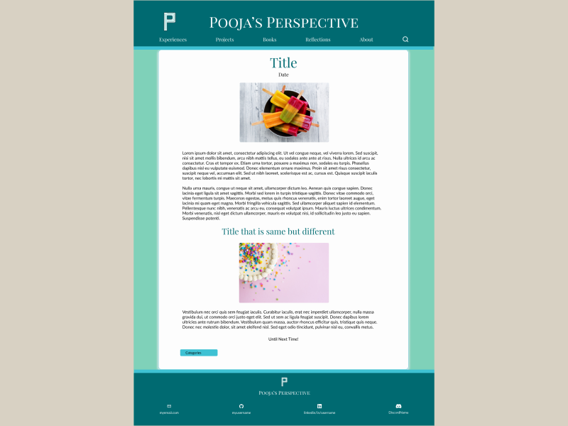
To design my own website I first perused some of the websites I like and made notes on what features I liked about them and didn’t like so I could implement them on my own website. After gathering all this information I then created a draft mock-up using Figma. I used Figma as I have used it in the past for some university projects. I first made a mock-up of the home page (see above) and then a mock-up of what an ideal blog post would look like (see below).
Implementing the Design
With Figma you can copy your design as CSS code but as it uses fixed dimensions I felt this would be more trouble then it is worth, and decided to use the mock-ups as a guide. From some more research and trial and error I was able to design my header. I was so pleased with it and pushed it and then eagerly opened it on my phone only to find it looked terrible. All because I had not designed it for the smallest screen first. To fix this I then quickly drafted up what I would like the website to look like on mobile and then made the changes so that it worked on as many screens as possible. Keeping this lesson in mind I then continued and although the process was slower than I liked the website eventually came together.
Reflections on the Process
Before starting the website, I was not aware of how much thought goes into it. Partially because during university we would be given project requirements and so were somewhat guided. Without that there is so much to think about from colour schemes, to layouts, even image sizes and how you want the content to load. Not to mention designing for multiple screens. There were also times when one change would break the entire layout and for the life of me, I couldn’t figure out why but later on I would figure out what the problem was and then fix it.
The process taught me not just in terms of how HTML, CSS, and JS works but also I got to see why certain design principles are there and why they are important. It also tested my problem solving and why it is important to be patient and to not get frustrated easily as you can miss details that would make the problem easier to solve.
The website is currently on its first iteration, it is not perfect but there is a lot to it that I am pleased with. The design is cohesive I feel I made good use of colours, and it is really easy to use. Further changes that I know will have to make will be implementing search functionality, making the entire post thumbnail clickable and changing the logo. But for now the changes I make will likely be writing more posts.
Until next Time!